The use of cutting-edge materials and manufacturing processes in the design and production of Elements_Efi has resulted in a product that is both durable and sustainable, reducing the environmental impact of its use.

The use of cutting-edge materials and manufacturing processes in the design and production of Elements_Efi has resulted in a product that is both durable and sustainable, reducing the environmental impact of its use.

The use of cutting-edge materials and manufacturing processes in the design and production of Elements_Efi has resulted in a product that is both durable and sustainable, reducing the environmental impact of its use.
The use of cutting-edge materials and manufacturing processes in the design and production of Elements_Efi has resulted in a product that is both durable and sustainable, reducing the environmental impact of its use.
AgodaVIP had real value, users just weren’t seeing it. I redesigned how value was surfaced across the landing page and deals experience, turning something hidden into something users could actually understand and use.
Feb - Aug 2022
PM, Engineers,
Marketing
2 Designers
Figma
UserTesting
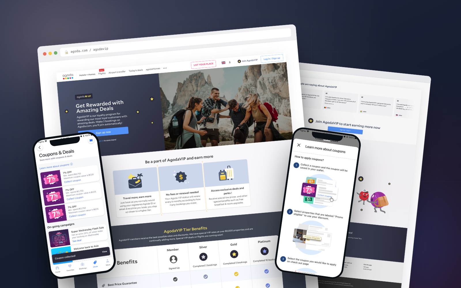
When I joined the growth team, I spent time using the product the way a new user would. AgodaVIP offered real benefits: deals, cashback, and perks across the platform. But as a new user, none of that was obvious. The landing page didn’t clearly explain the program, and the deals page felt unstructured and hard to navigate.
A lot was happening behind the scenes, but users weren’t seeing any of it.

Full VIP experience to pinpoint where value was getting lost
I validated the instinct with product metrics. The VIP landing page had low traffic, shallow scroll depth, and clear drop-off in the sign-up flow. Users weren’t engaging with the page, and many left before understanding the value. But metrics only showed what was happening, not why.
To understand that, I partnered with the UX research team to run a user awareness survey.

Drop-offs / interactions across VIP journey

User awareness survey highlighting gaps in understanding of rewards and VIP benefits
Users consistently said price and deals were key reasons they chose Agoda. But most didn’t know AgodaVIP gave them access to better ones. They weren’t aware of available discounts, didn’t understand the benefits, and hadn’t meaningfully engaged with the program. There was a clear gap between what the product offered and what users perceived.
Redesigns are rarely a priority on growth teams, so I didn’t position this as a UI improvement. I framed it as a revenue opportunity by tying user confusion directly to drop-off in the funnel and missed engagement with deals.
I combined product metrics with competitor benchmarking to identify what was missing, breaking the experience down into must-haves and nice-to-haves.

Competitor benchmarking: identifying must-haves for an effective loyalty landing page.
Users needed to quickly understand what VIP offered, why it mattered, and what to do next. The existing page failed to do those things. For the redesign, we focused on:
I worked with another designer to explore different directions for each section, aligning with engineering early to ensure feasibility.

Four layout explorations for the "How AgodaVIP Works" section
The PM and I split the changes so we could track the effect of each update and test as we went. Not every version performed the way we hoped, but each round gave us something useful. We used each test to narrow in on what worked, simplifying where needed and reinforcing what users understood.

A/B test versions: current design vs redesign, with a benefit table comparison tested across both

Redesigned AgodaVIP Landing Page
While we were working on the landing page, another issue became hard to ignore. Deals were everywhere: coupons, campaigns, and promotions across different surfaces. As more offers were added, the experience became harder to navigate. It increased cognitive load.
More offers ≠ more usable value.
Finding a deal was one problem. Using it was another.
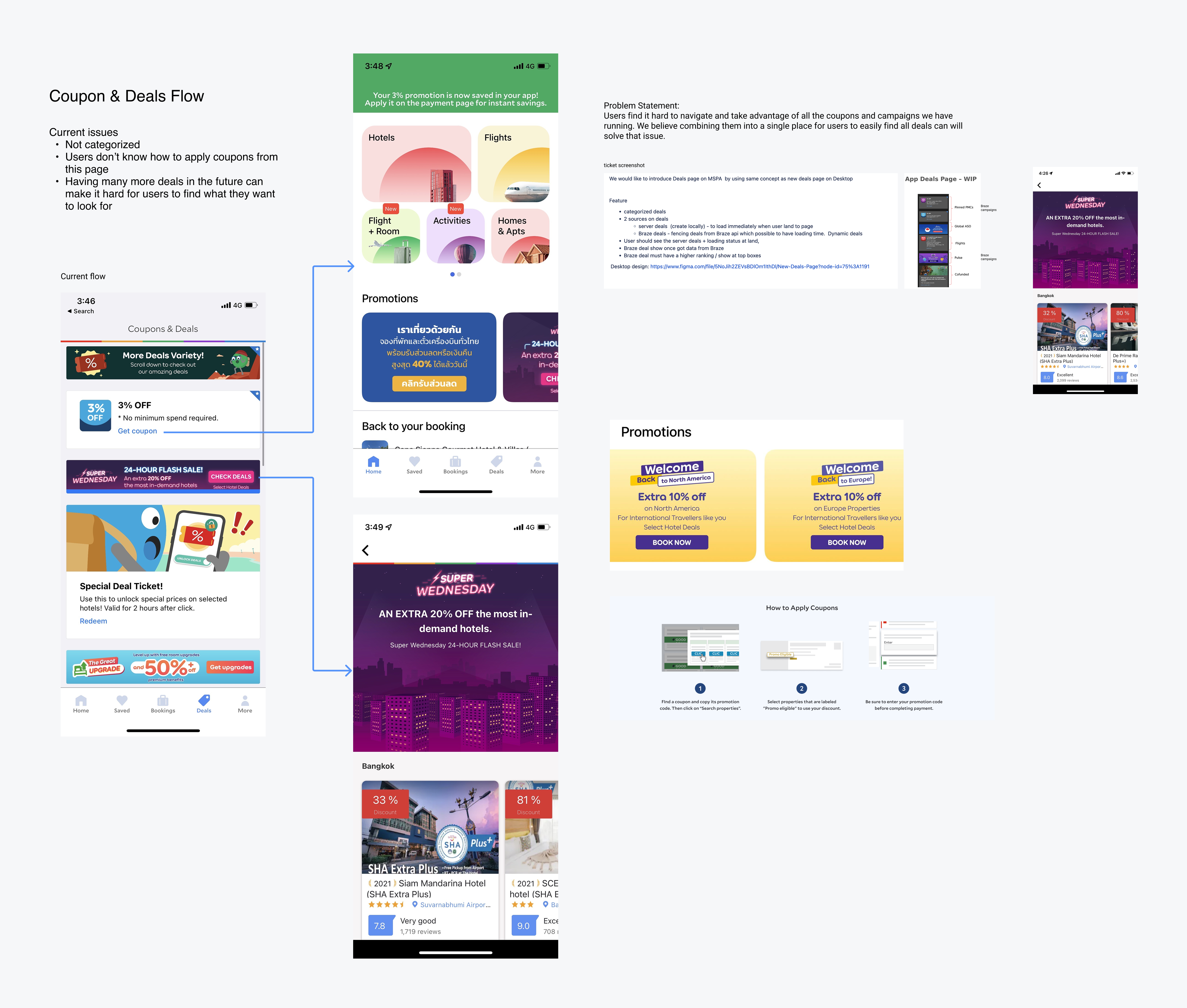
Identifying issues: coupon & deals flow
Instead of jumping straight into UI, we stepped back and reframed the problem. Working with another designer, we ran a lightweight card sorting exercise to understand how users naturally grouped different types of deals (coupons, limited-time campaigns, VIP offers, and promo codes).
This helped us move away from internal categorizations and design a structure that matched user mental models.
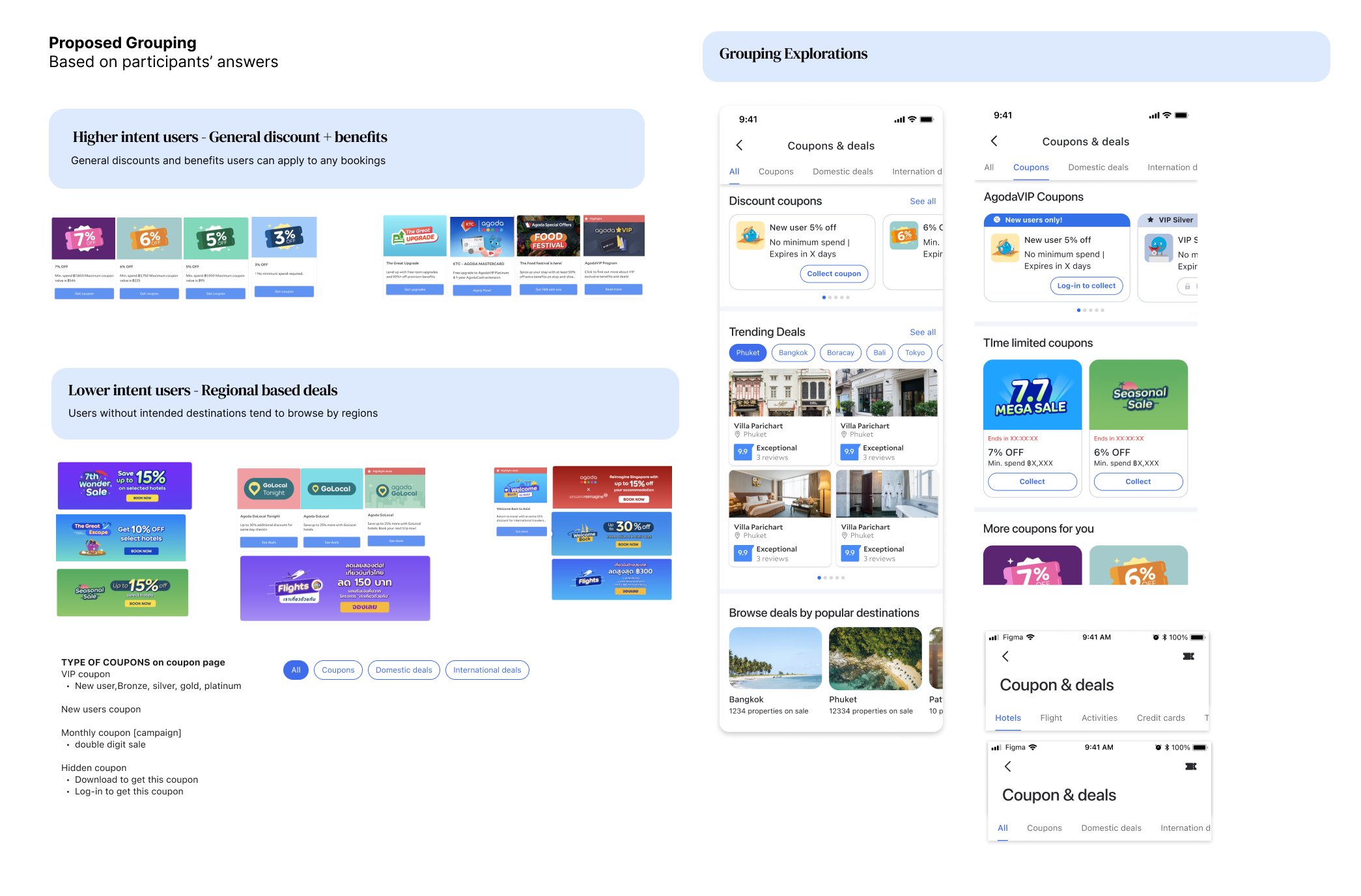
Grouped deals into clear categories
Together with another designer, we proposed a revamped experience of discovering and applying deals. The idea was to transform it into a system where users could:
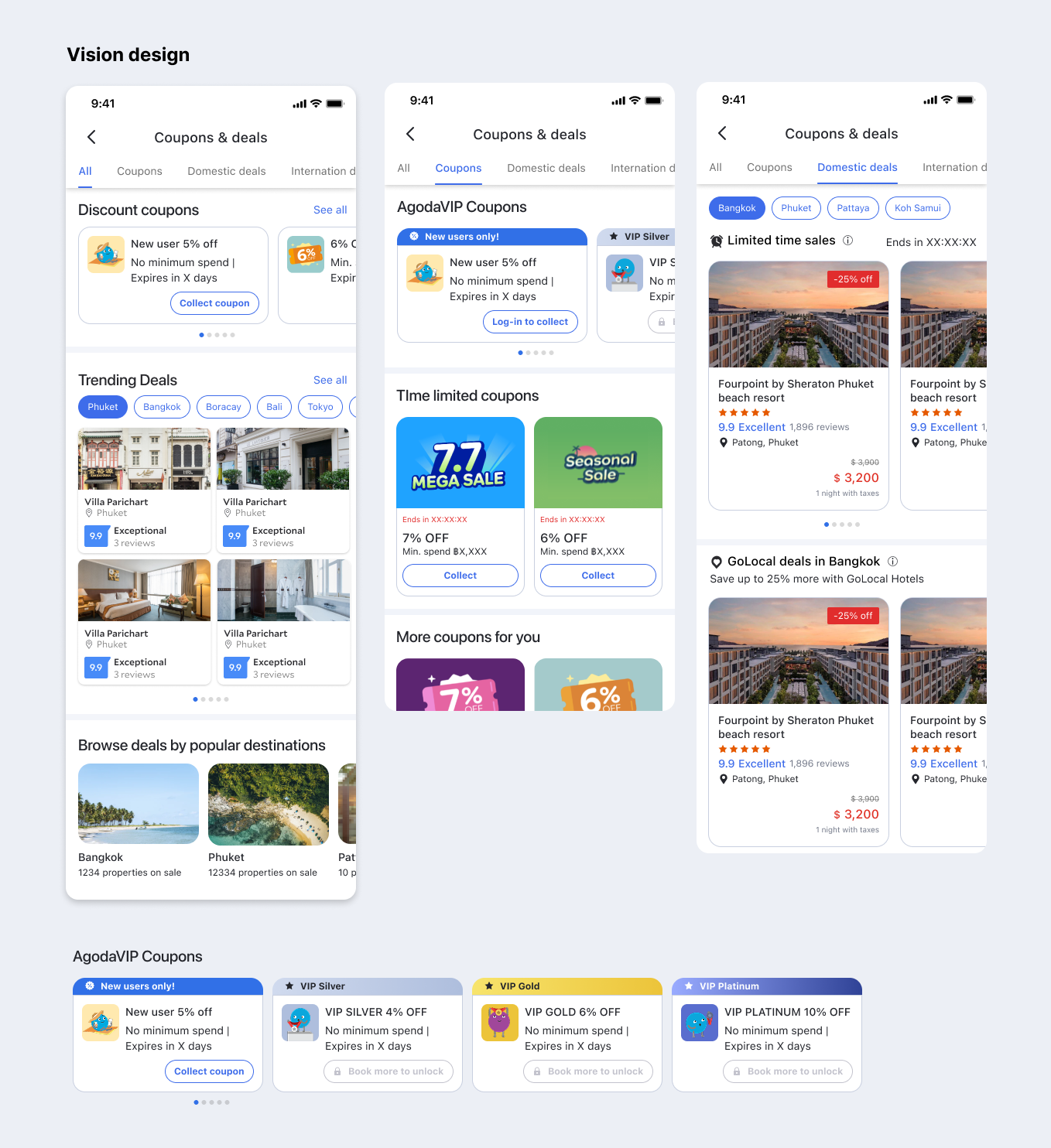
Deals page redesign
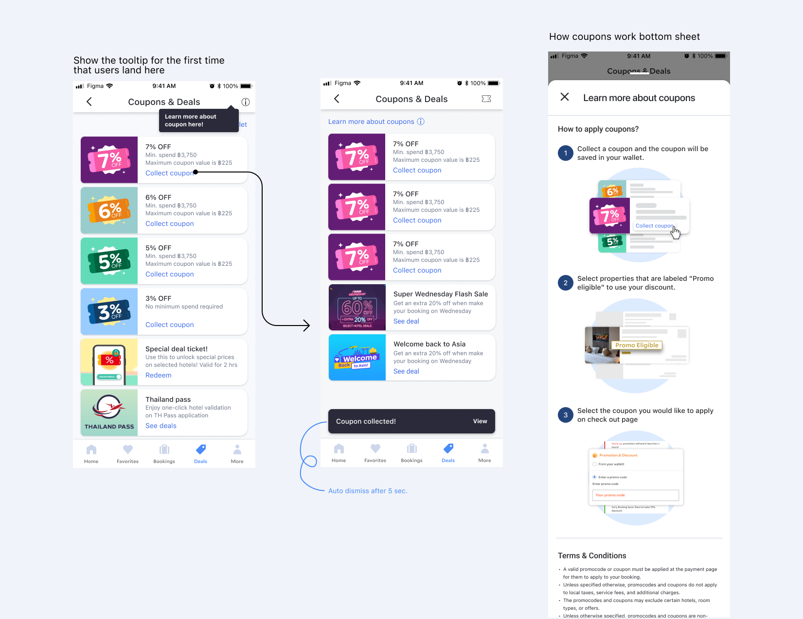
While the full vision was defined, we prioritized foundational improvements first. We focused on making coupons easier to understand and use before introducing more complexity, ensuring users could take action before optimizing the experience further.
Grouped coupons into clear categories and reduced visual noise so users could scan quickly.
Introduced a consistent “collect → apply” flow so users understood exactly what to do.
.png)
Deals page redesign
Deals page redesign
Added lightweight guidance and tooltips to explain how coupons work, only when needed.
Gave users confirmation when a coupon was collected and made it easier to access in their wallet.
The landing page redesign led to an 18% increase in VIP sign-ups. The deals experience improvements increased coupon interactions and usage, driving a 12% lift in deal-related conversions. These changes turned passive exposure into active engagement, helping users not just see value, but act on it.
The longer-term vision for a personalized deals system was approved, with foundational improvements shipped and future iterations continuing beyond my time on the team.