The use of cutting-edge materials and manufacturing processes in the design and production of Elements_Efi has resulted in a product that is both durable and sustainable, reducing the environmental impact of its use.

The use of cutting-edge materials and manufacturing processes in the design and production of Elements_Efi has resulted in a product that is both durable and sustainable, reducing the environmental impact of its use.

The use of cutting-edge materials and manufacturing processes in the design and production of Elements_Efi has resulted in a product that is both durable and sustainable, reducing the environmental impact of its use.
The use of cutting-edge materials and manufacturing processes in the design and production of Elements_Efi has resulted in a product that is both durable and sustainable, reducing the environmental impact of its use.
I was brought onto Agoda’s growth design team to define the entry tier of the VIP program from scratch. The challenge was bigger than designing a badge. I had to brand it in a way that felt premium without competing with higher tiers, and make sure it worked across every page on the product.
Dec 2021 - March 2022
PM, Engineers
Marketing
Me as designer
Figma
The existing loyalty structure had Silver, Gold, and Platinum. Before Bronze existed, Agoda’s lowest-tier users had no identity in the product. If you had fewer than two bookings, you were just “Agoda Member.” No badge. No color or sense of belonging to anything.
Increase awareness and engagement among newer users while making the entry tier feel like it actually belonged in the VIP program.

Before the rebrand
Before designing anything, I had to answer three questions:
What do we even call it?
What color feels premium without competing with higher tiers?
How do you make the lowest tier still feel worth earning?
They sound simple, but each decision affected the entire platform.
I started by auditing how successful loyalty programs use color and naming to signal hierarchy.
What feels premium vs. cheap?
What sits naturally below Silver?
What still feels like a reward rather than a downgrade?
The pattern was clear: most programs use metals or materials, warm tones for entry tiers, and cooler tones as status increases.

Competitive audit of loyalty programs to understand how naming and color signal status
I explored multiple badge directions and shared five options with the design team. Not to outsource the decision, but to pressure-test it early on. The feedback surfaced real tension. Some felt too warm and cheap. Some were too close to Gold. Some looked good in isolation but failed accessibility.

Internal survey & feedback to pressure-test naming color directions
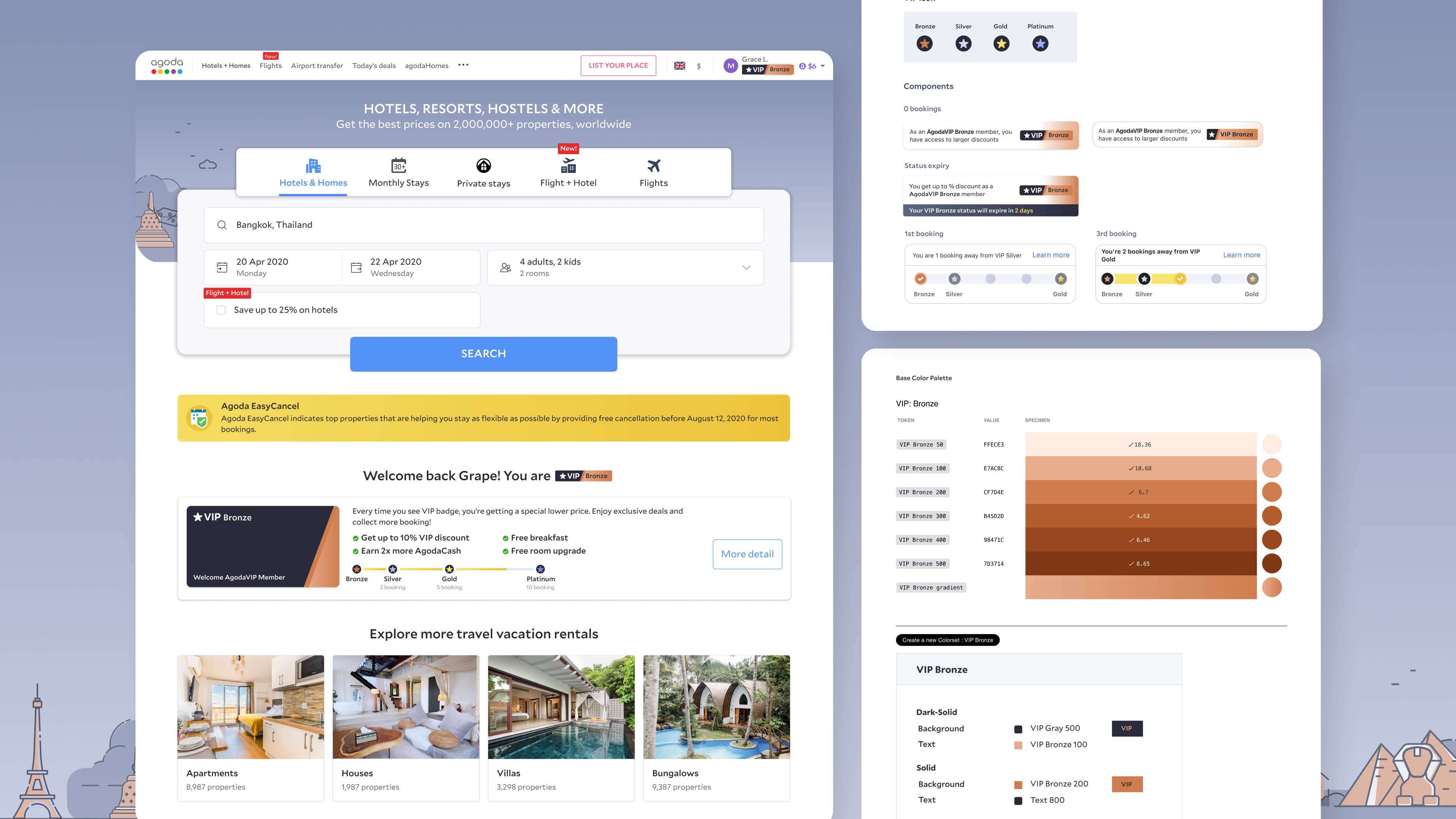
After multiple rounds of testing across real product surfaces, I landed on a bronze palette that felt earned. Warm enough to feel distinct but muted enough not to compete. I then ran contrast checks on every shade using WebAIM's contrast checker to find the color that would work across every surface in the product.
I mocked up badges, labels, banners across the entire platform, every context a user might see it. Then presented to the product marketing team and partner teams for approval. Getting buy-in meant proving: it worked across contexts, it was accessible, and it wouldn’t break existing flows.

Bronze shade explorations with accessibility checks. Desktop & app mockups showing new branding in context.
Once approved, I worked with design systems to translate the palette into tokens for implementation. I documented token names, usage rules, component states, and platform-specific guidance so engineering team could apply the new tier consistently.


Final Bronze system across web and app: tokens, rules, components, and implementation guidance
The library included badges, banners, reward labels, and guidance across all tiers. It was adopted by three cross-functional teams and became the reference point for VIP design standards moving forward.

New Master Component Library for Loyalty Team
The rebrand passed A/B testing and led to a 19% increase in VIP bookings from entry-tier users. It shipped to millions of Agoda users globally and gave the lowest tier something it had never had before: a clear identity in the system.
What began as a badge rebranding ended up improving cross-team consistency, reducing implementation ambiguity, and creating a stronger foundation for the VIP program overall. It also taught me that branding work inside product is rarely just visual.