The use of cutting-edge materials and manufacturing processes in the design and production of Elements_Efi has resulted in a product that is both durable and sustainable, reducing the environmental impact of its use.

The use of cutting-edge materials and manufacturing processes in the design and production of Elements_Efi has resulted in a product that is both durable and sustainable, reducing the environmental impact of its use.

The use of cutting-edge materials and manufacturing processes in the design and production of Elements_Efi has resulted in a product that is both durable and sustainable, reducing the environmental impact of its use.
The use of cutting-edge materials and manufacturing processes in the design and production of Elements_Efi has resulted in a product that is both durable and sustainable, reducing the environmental impact of its use.
The first internal product designer at a crypto gaming startup. No design foundation, no component library, just a live product moving fast. I built the system from scratch. Color tokens shipped to codebase, a custom Figma plugin, and full handoff to the next designer.
August 2025 - Present
Engineers
Me as designer
Figma
Claude
The timing worked in my favor. The team was already thinking about rebuilding parts of the site, so instead of pitching a big proposal, I started small. I focused on what was already breaking, fixed inconsistencies, and shipped improvements that developers could immediately use. Once those changes started saving time, it became easier to keep going.
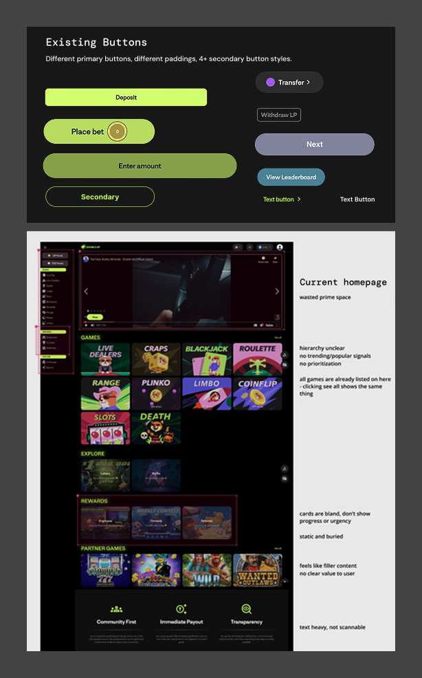
Auditing site, games and noting inconsistencies
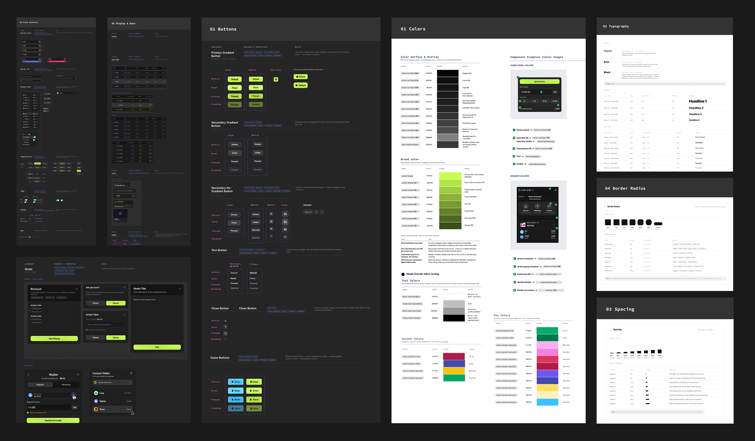
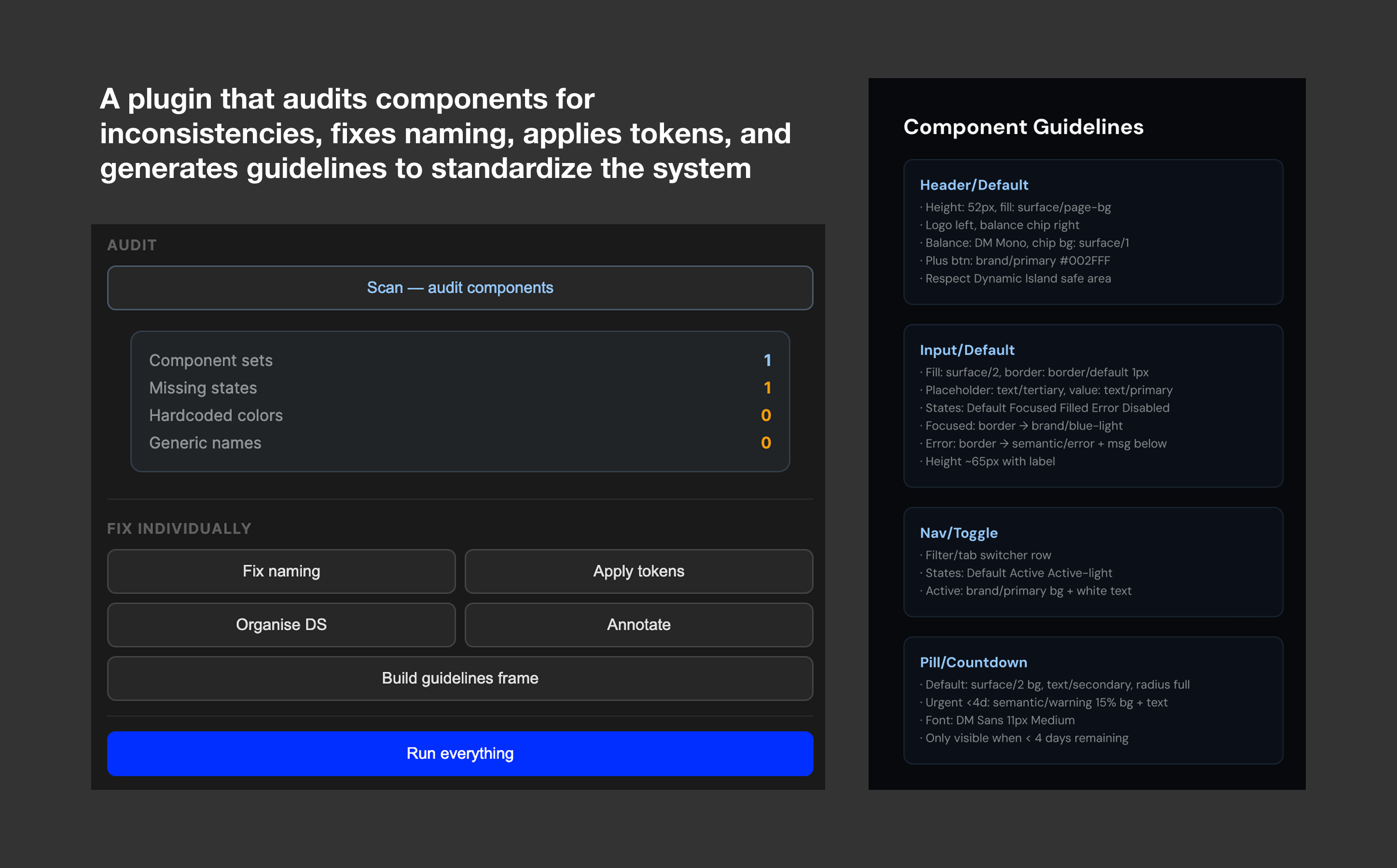
I wasn’t asked to build a design system, but it quickly became clear that without one, the team would keep rebuilding the same things over and over. Every new feature started from zero. The challenge wasn’t just designing the system, it was proving that it was worth the time in a fast-moving startup.
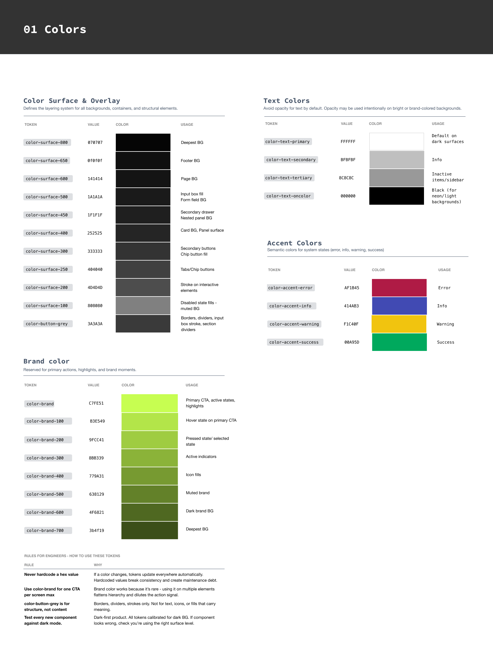
Color token system alongside CSS variable implementation
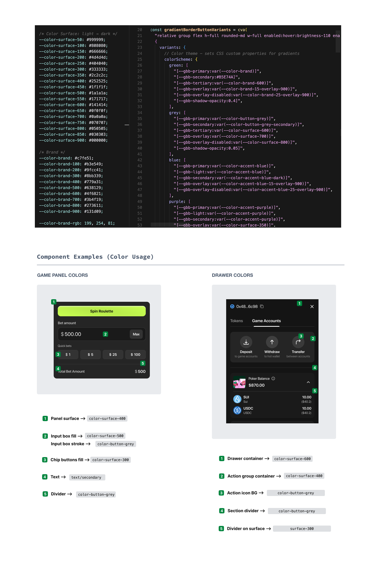
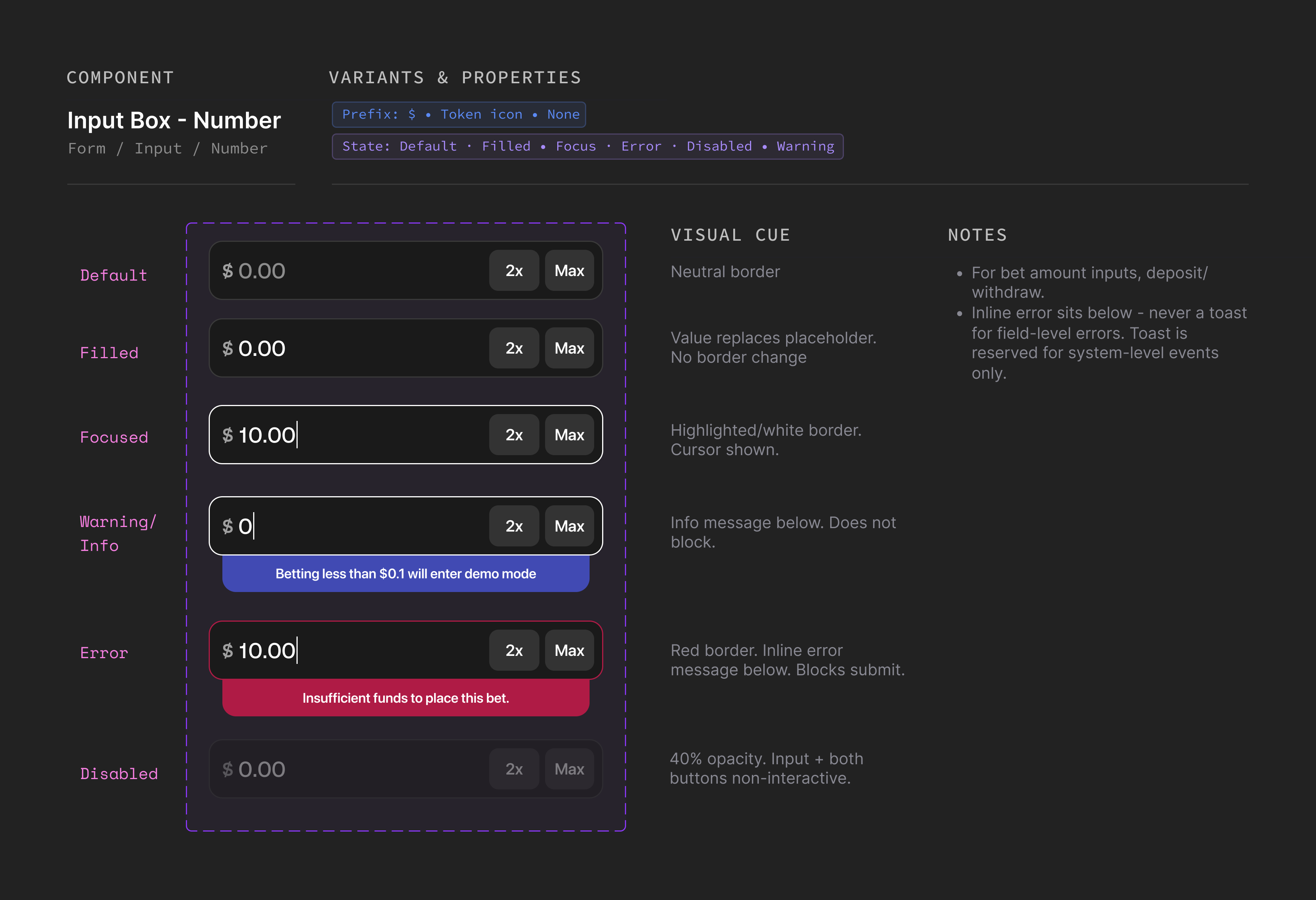
Input box component state coverage
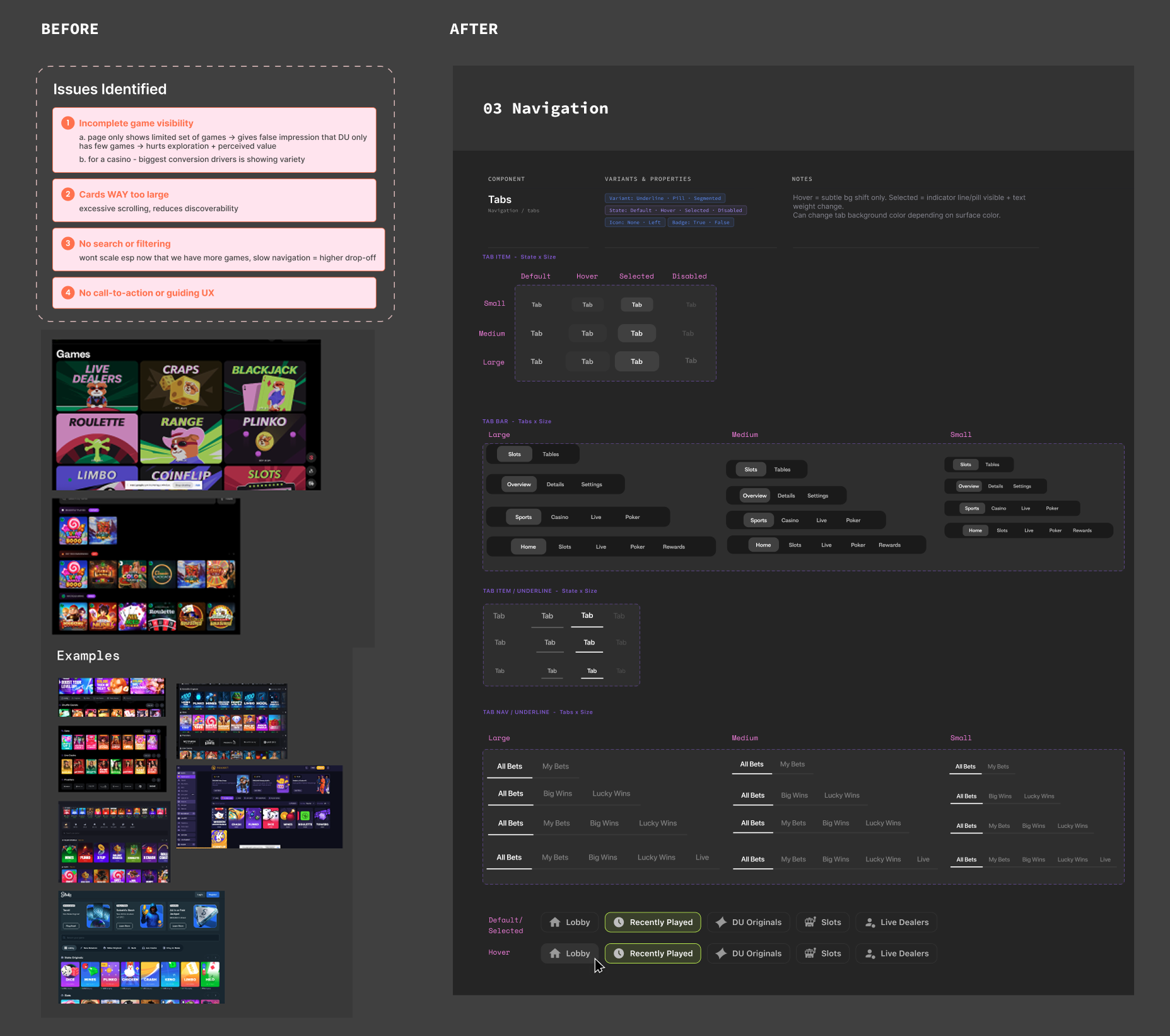
Tabs and filters with reusable variants and states across pages
Some parts of the system needed more than consistency, they needed a rethink. The feedback system was one of them. Wins, errors, and warnings all looked the same, which created unnecessary anxiety in a product where users are dealing with real money.
I audited every existing feedback state and rebuilt the system with clear types, behaviors, and timing so users could understand what was happening at a glance.
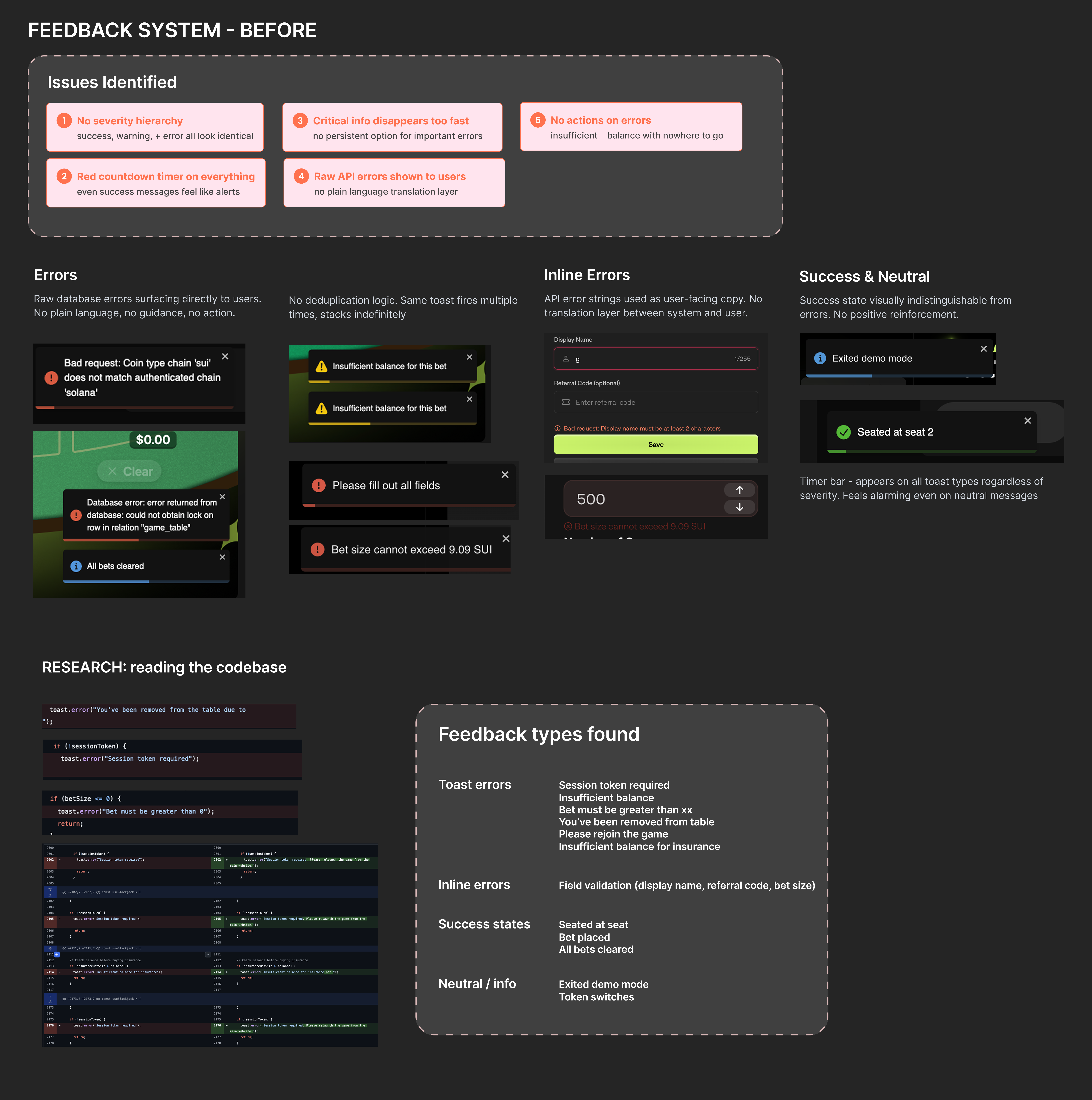
Feedback system before
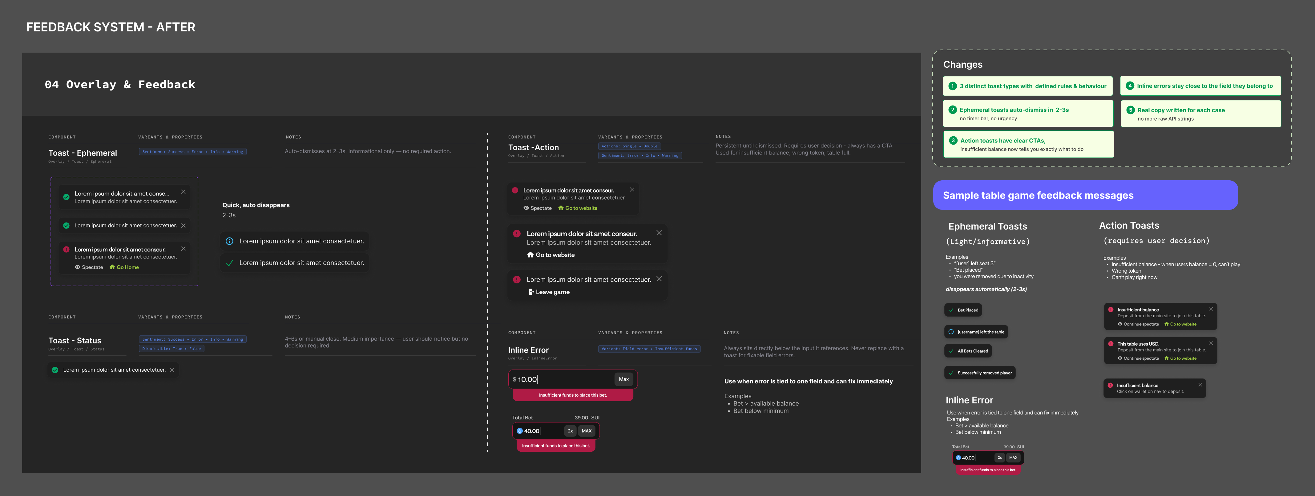
After - feedback types with variants, timing, sentiment and real copy
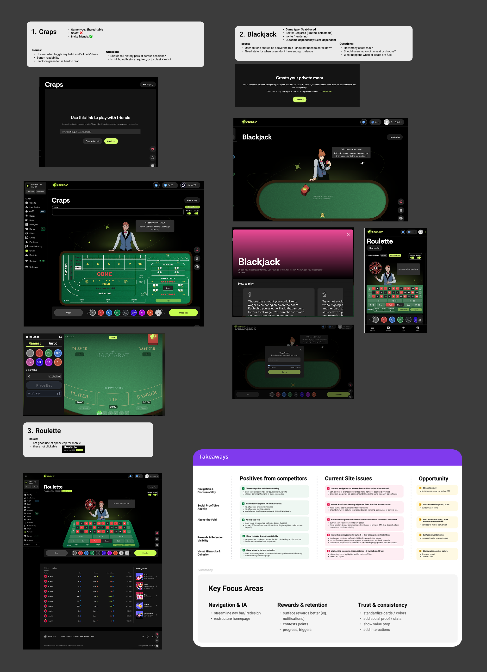
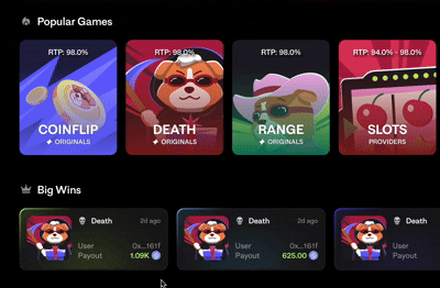
The game panel was another major issue. It’s the most-used UI in the product, but every game had built it differently. I mapped patterns across games and found fundamentally different needs:
I standardized both into shared components that worked across all game types.

Before: Game panel audit and issues identified
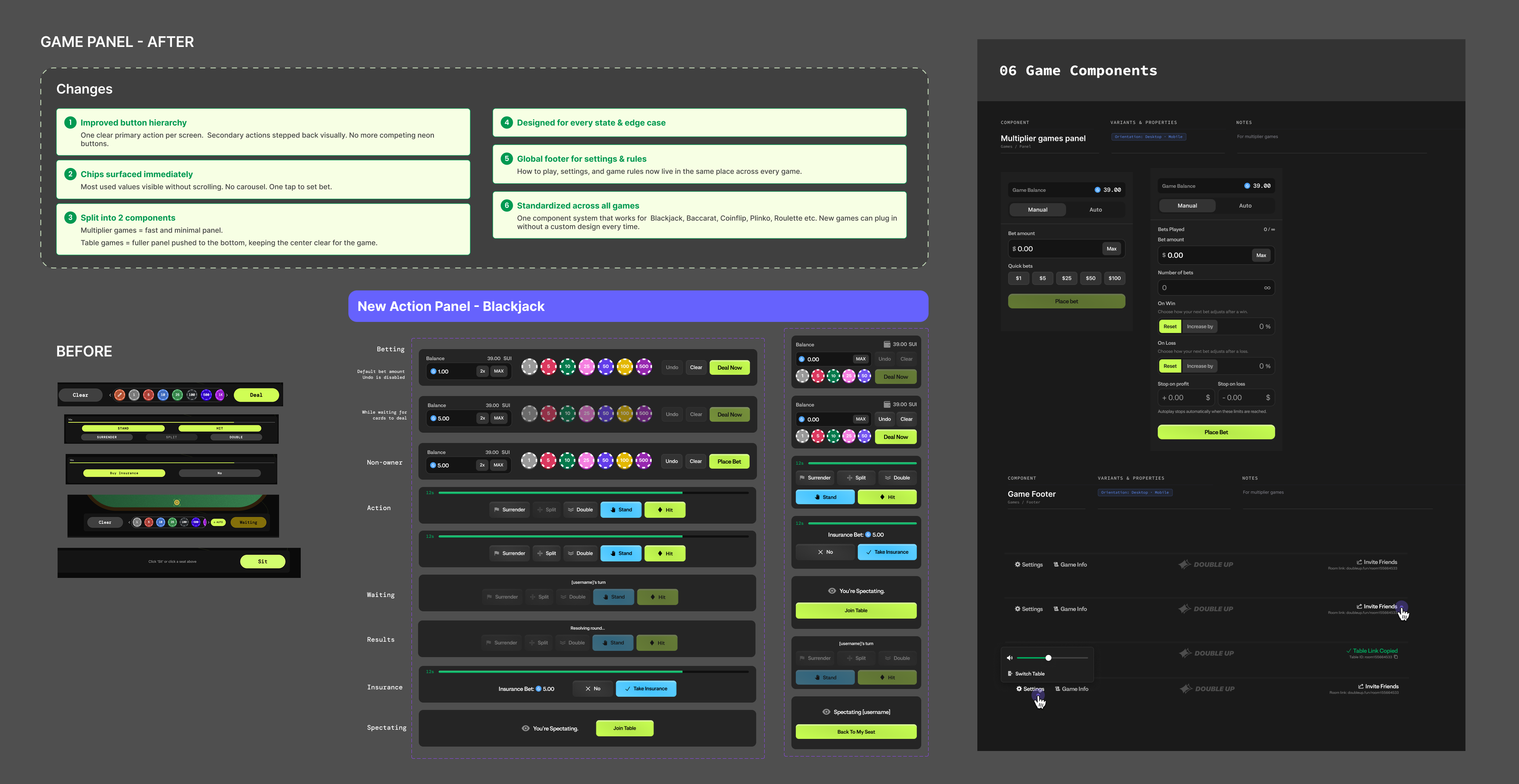
Game panels after: One-shared system
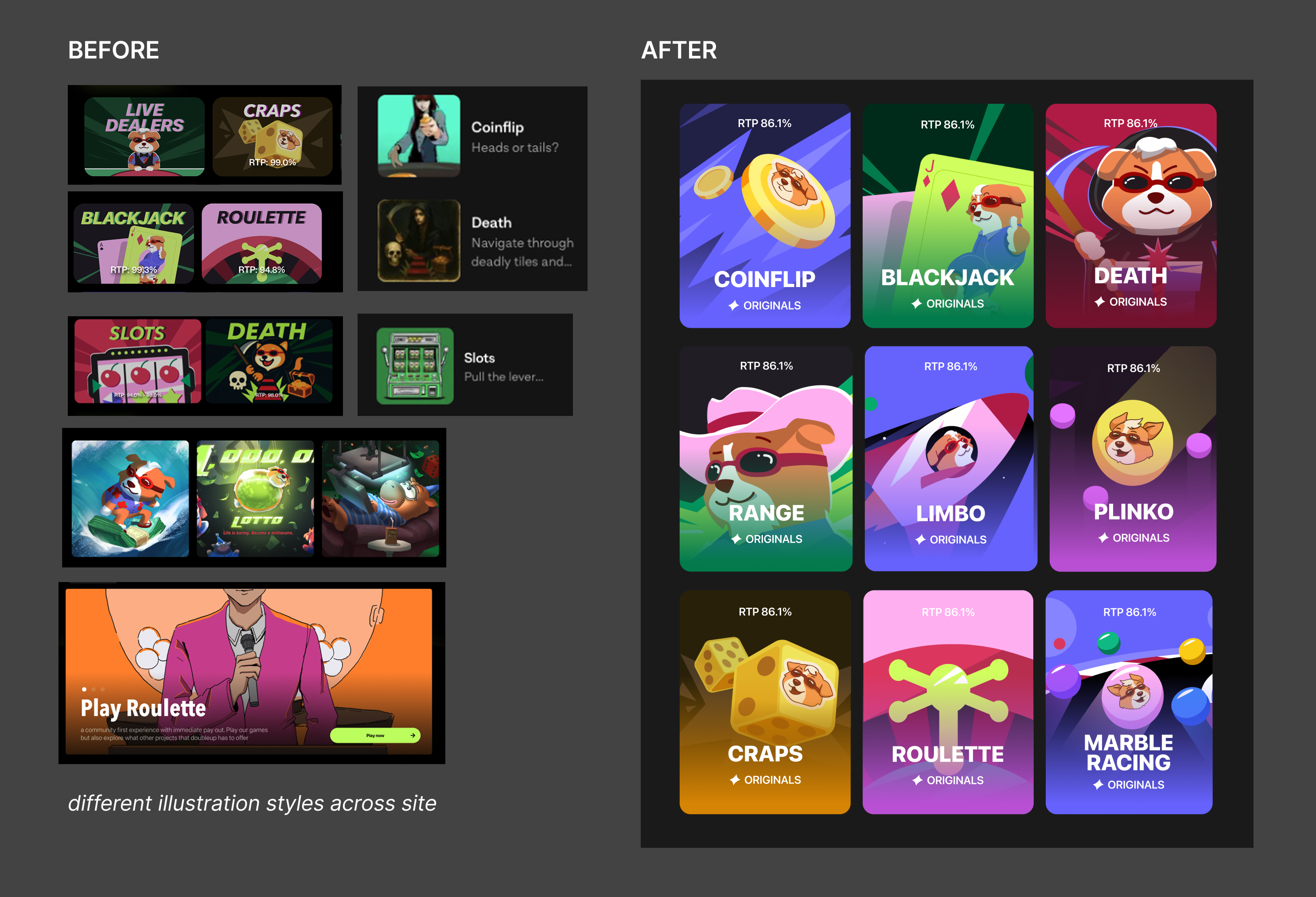
Illustrated game thumbnails in a coheesive style and rewrote the brand copy and tone across the product.
Prototyped hover states and micro-interactions
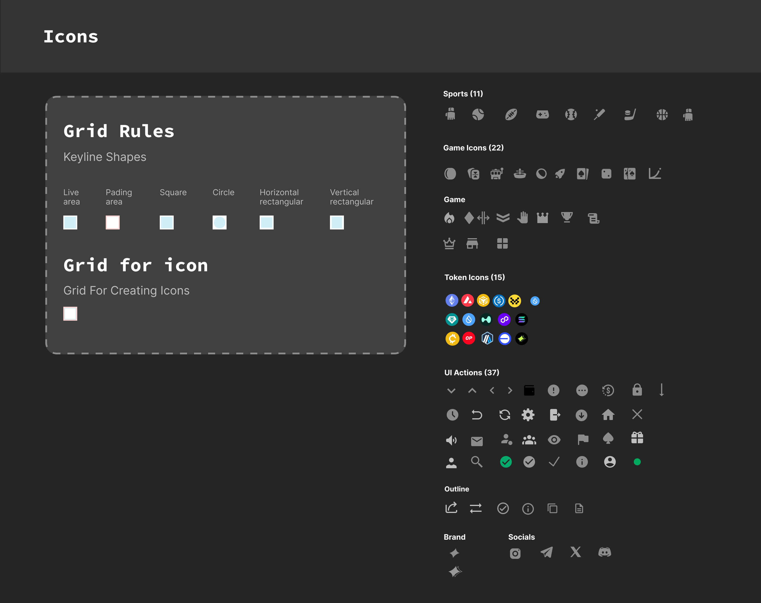
Icon library - grid rules, keyline shapes
The system grew into 120+ components with full state coverage and is now used across multiple products. Designers and engineers can work more independently, and features that used to take weeks now ship in days. I also onboarded a second designer into the system, making sure it was something they could actually understand and build on. Now design work that used to take months takes weeks. Full game interfaces that required weeks of back-and-forth can be turned around in days.
I onboarded a second designer into the system, ensuring it was understandable, usable, and maintainable. What used to take months now takes weeks, and complex interfaces can be built in days.
This project was as much about product thinking as design. Building the system solo meant constantly deciding what mattered most, what would unblock the team, and where to focus for maximum impact. It also forced me to deeply understand components (because you don’t fully understand one until you’ve designed it across every edge case).