The use of cutting-edge materials and manufacturing processes in the design and production of Elements_Efi has resulted in a product that is both durable and sustainable, reducing the environmental impact of its use.

The use of cutting-edge materials and manufacturing processes in the design and production of Elements_Efi has resulted in a product that is both durable and sustainable, reducing the environmental impact of its use.

The use of cutting-edge materials and manufacturing processes in the design and production of Elements_Efi has resulted in a product that is both durable and sustainable, reducing the environmental impact of its use.
The use of cutting-edge materials and manufacturing processes in the design and production of Elements_Efi has resulted in a product that is both durable and sustainable, reducing the environmental impact of its use.
I was handed a brief: build a multiplayer poker game from scratch, fast. No existing components, no design precedent at the company, and I had never played poker in my life. This is how I figured it out.
April 2025 - July 2025
Engineers
Me as designer
Figma

I wasn’t a poker player. My first step was learning the game deeply: how players think, how money flows, and how competitors structured engagement. Approaching poker with a beginner’s mindset let me strip away unnecessary complexity and rebuild the game into something intuitive, fair, and engaging for both crypto-first users and casual players.

To bridge my knowledge gap, I conducted:
1. Competitor Audits – Played on platforms like Zynga and PokerNow, mapping flows from lobby → buy-in → gameplay → results.
2. User Interviews – Teammates (poker players + crypto users) became my test group. I asked questions like: What breaks your trust? What makes you choose one platform over another?
Insights:
• Simplicity wins under pressure. When money is on the line, players don't want to think about the UI.
• Animation isn't decoration. It's how players understand what just happened.
• Trust is fragile in crypto. A confusing withdrawal flow loses players permanently, not temporarily.
Competitor Research

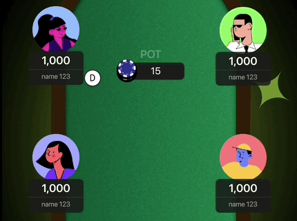
Early wireframes mapping poker flow and table layout

First detailed iteration of the end-to-end gameplay flow
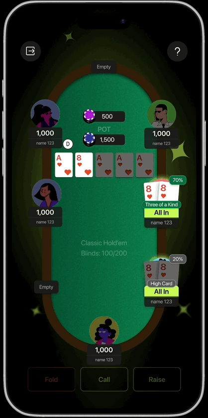
Iterating on the player timer
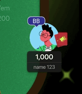
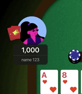
Final player avatar designs and components
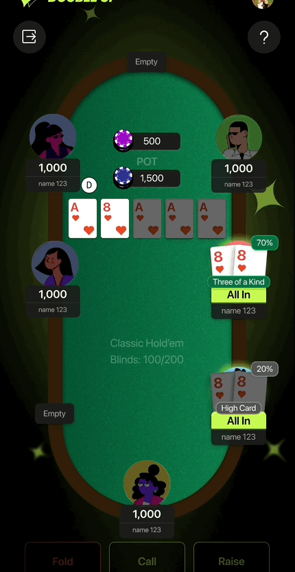
User goes all in
User Folds
Final player avatar designs and components
Poker is a game of exceptions: timers expiring, players disconnecting, or chips running out mid-hand. I worked closely with engineers and players to stress-test flows against these edge cases, making sure gameplay stayed fair and functional under pressure. This not only improved usability but also reduced the risk of costly rework late in development.

Designing clarity for rare but critical edge case flows
After animating and prototyping key flows and edge cases, I consolidated the designs into a detailed, structured handoff. My goal was to ensure engineers could build quickly without ambiguity. I organized flows and edge cases, anticipated dev questions, and designed a poker lobby that balanced simplicity for implementation with the clarity players needed (buy-ins, seating, waitlists).

End-to-end flow with edge cases and lobby design
Being at an early-stage startup, I had to prioritize what was essential for an MVP. I focused on what players needed most to start playing and trusting the product, while advanced features like stats and history were pushed to Milestone 2. To guide these tradeoffs, I asked players directly: What do you actually need during play? What feels helpful vs. distracting?
After finalizing the MVP, I designed additional features for Milestone 2, things that would enhance players' experiences even further. Example features: table info, hand recap stats, and waitlists

End-to-end flow with edge cases and lobby design
Not knowing the domain can be an advantage. Going in without poker knowledge forced me to question everything. Why does this button need to be here? What does "the flop" actually mean for the UI? That beginner's mindset stripped away assumptions and led to cleaner decisions early on. But there's a point where you need to stop questioning the rules and start designing within them.
Edge cases are where the real design happens. What actually took time and what actually matters to players is what happens when someone disconnects mid-hand, runs out of chips, or joins a full table. Those states are rare but they're high stakes. Getting them wrong destroys trust instantly. I spent as much time on edge cases as I did on core flows, and I'd do it the same way again.
Animation is a design decision. I used to think of motion as polish you add at the end. This project changed that. The card reveal, the chip movement toward the winner, the fold animation. These aren't decorative. Motion carries information in a game in a way that static UI simply can't.
Designing for real money changes everything. In a crypto game, trust isn't a nice-to-have. A confusing withdrawal flow, an unclear balance state, an error message with no next step. Any of these can be the last thing a player sees before they leave and don't come back. That context made every decision feel more considered. I think it made the work better.